Welcome to The Gleaner – For Today
A new-look Gleaner hits news stands this morning, January 8, marking the first wide-scale design change to this 183-year-old publication since 2001, when a series of incremental changes were made.
After much consultation, we've redesigned our newspaper for the digital age, updating the look and feel and improving readability. The Gleaner, for today, is easier to navigate and read. Our focus is blending stunning visuals and pointed text with compact storytelling.
Here are more reasons to grab a copy today:
1. Cleaner. Modernised. Enhanced.
We've streamlined our pages for a better reading experience. With a more modern and uniformed layout, our stories are simpler to follow. The multiplicity of design options gives us added flexibility. Look out for an exciting front page, every day.
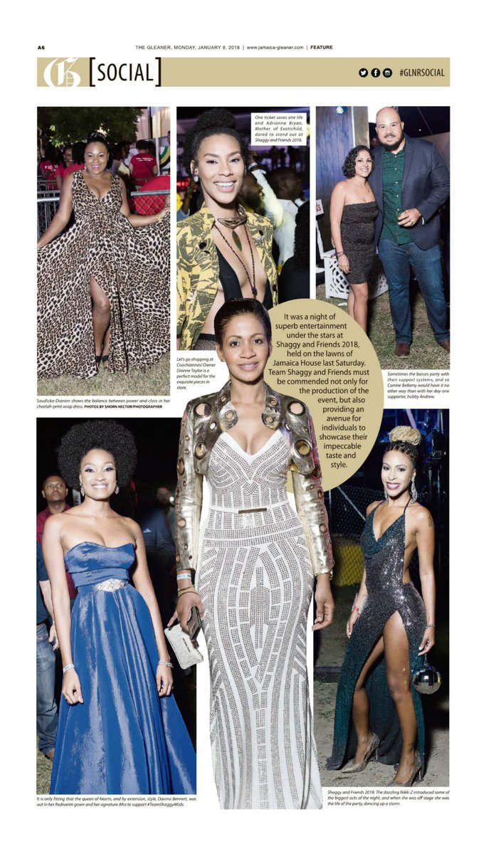
IN PHOTO: A screenshot of today's social page
2. Easier to read.
The Gleaner is now more reader-friendly. We heard you and we've made our body type larger.
3. Never miss a highlight.
Navigate The Gleaner in a way you never have before with new keys and promos. Quickly find what you want in our revamped sections.
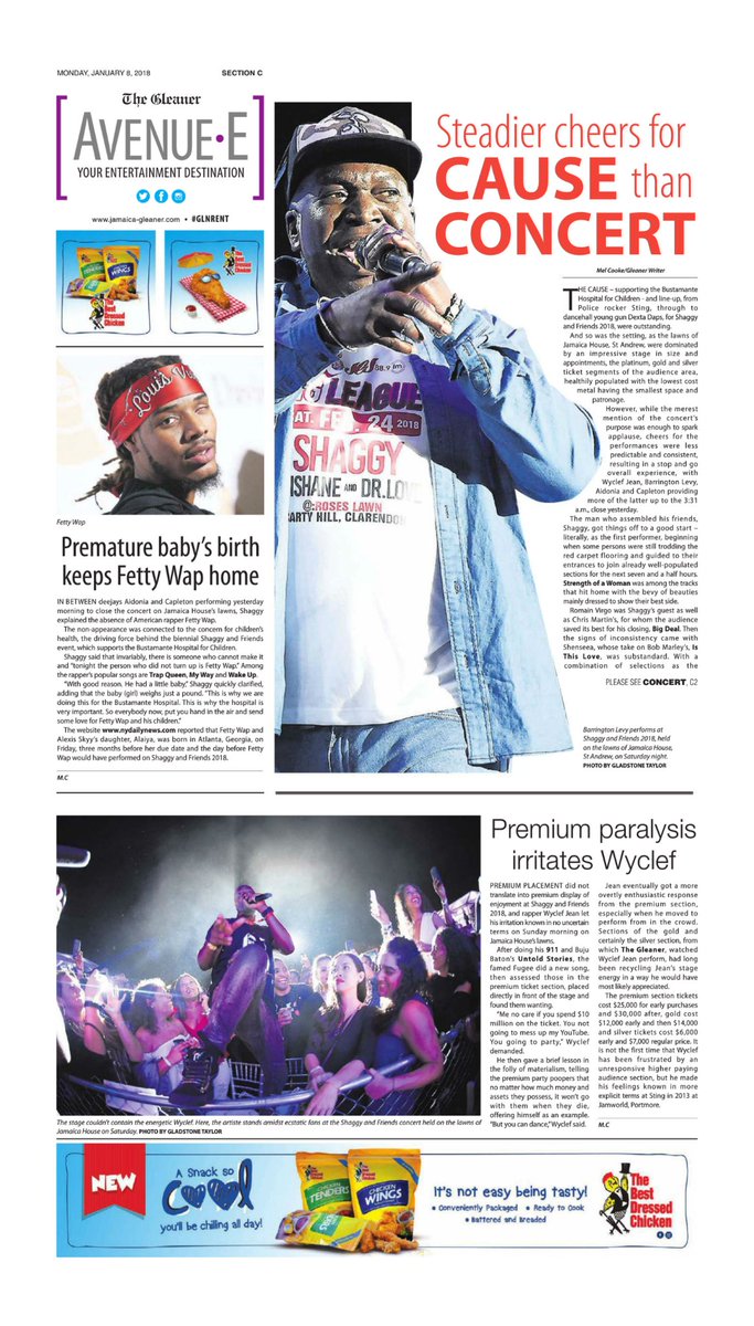
IN PHOTO: A screenshot of the new-look entertainment page
4. Impressive images and illustrations
The new design is centred on better visuals, including larger photographs and more graphics. Get photos of the day, quick bites, interesting titbits and daily infographics.
5. Your favourites, revamped.
We've improved key sections.
- Introducing Living: a mix of social, style, home and travel.
- Health is now Health and Fitness.
- Entertainment becomes Avenue E, your entertainment destination.
- Business becomes Finance.
IN PHOTO: Get the scores on our new-look sports page

